Your business is our priority!
A full range of business services is available to assist your business in achieving its objectives.
Website Font Selection
Use Readable Fonts
Use Familiar and Readable Fonts to Improve Website Usability
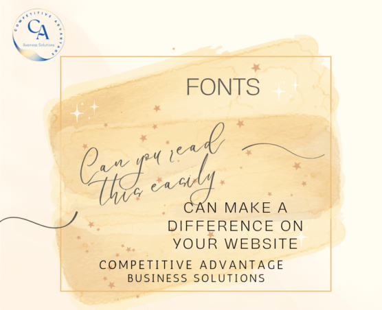
Website Font Selection matters! Choosing the right fonts to complement your website is an important part of building a website.

There are many factors that affect the usability of a web site. To make sites noticeable to users, site owners must make use of attractive design and functional content. Therefore, website font selection is important to the success of your website. The usage of fonts is one of the factors that can draw or veer away visitors to a web site. Good fonts are important because it influences how fast users can read whatever content is present on the computer screen.
Fonts are utilized to make much of the web page elements, such as navigation bars, buttons, links, and menus. It is the text that will express most of the web site's content.
At present, the fonts that are commonly used on the Internet are Times New Roman, a serif font, and the Arial, a sans serif font. The primary edge of serif fonts is that it is more comfortable to read it on paper, because serifs help individualize each letter. However, this advantage can be rendered useless when the fonts are viewed on computer screens, since factors such as screen resolution can affect the clarity of texts.
So how do fonts influence the overall usability and legibility of a web site?
Major Categories of Font Faces for Website Font Selection
There are two major categories of font faces:
1, Serif - These are fonts that contain small appendages in the upper and lower part of a letter. Examples are Times New Roman, Century, Bookman, and Courier. These are the choice faces to be used for enormous quantities of text.
2. Sans-serif - These fonts have only primary line strokes and possess a simpler shape. Examples of these fonts are Futura, Helvetica, and Arial. They are usually utilized for short phrases.
Styles
Font style pertains to the usage of elements such as italics, underlining, and boldfaces to give better emphasis to the contents of a page. It is not advised to utilize underlining on web pages, since most of the users are used to associate underlining's with links. Boldfaces should be used in a strategic way. Too much usage of boldfaces can be distracting from the content since they are extremely visible. Since italics are not very legible on the screen, they should be used infrequently, just enough to provide emphasis and definition to terms.
Avoid using absolute font sizes. Doing so may hinder users the ability to adjust the sizes of the text to go along with the specifics of display devices that they are using. It is recommended to let users manipulate the size of the texts, especially if one plans to keep the web pages short.
Color
Choosing font colors should be done with care, it should maximize the legibility of the text in contrast to the background of the page while setting it apart from colors used for links. For light backgrounds, one should use fonts in black, dark green, deep brown, and dark blue. If the background is dark, fonts in white, pale green, and pale orange should be used. If possible, use only one or two font colors in a page, excluding the colors for the link pages.
Other important tips for website font selection
There are images that look like fonts. Avoid using them. There are several reasons why one should not utilize .jpg or .gif images to acquire special effects. First, images take a long time to download, and when it appears, the quality is different from the text produced by the browsers. Second, there usually is a problem when resizing images. Third, these images cannot be recognized by voice-enabled browsers.
It is said that Sans serif fonts should be used for standard and top-of-the-line web site designs, specifically the Arial and the Verdana. It is recommended to use the same font throughout a page, but headline sizes can be added, and the subheadings can be written in bold form to prevent monotony. Again, it is preferable to give users the ability to control the size of the texts, since some of the users can be visually challenged.
Some studies show that fonts that are tinier than 10-point get slower reactions from users. It is advisable to use fonts that are at least 12 or 14-point in size when it comes to people over the age of sixty-five.
The quality of a well-designed web site is that it can be accessed and used by people from all levels of society. Web sites should be designed to suit everyone who will be able to visit them.
Let us help you with your new website design needs. - Learn more about how we can help.
To learn more about this topic check out this article: https://www.cultrix.co.uk/web-academy/why-font-matters-in-web-design/